LRI provides its clients with an exclusive Client Member Area, which contains tools used by LRI consultants to strengthen teams and organizations. These tools range from PDF worksheets to video courses and supplemental training materials.
Are you an LRI consulting client? Request client access by emailing [email protected]
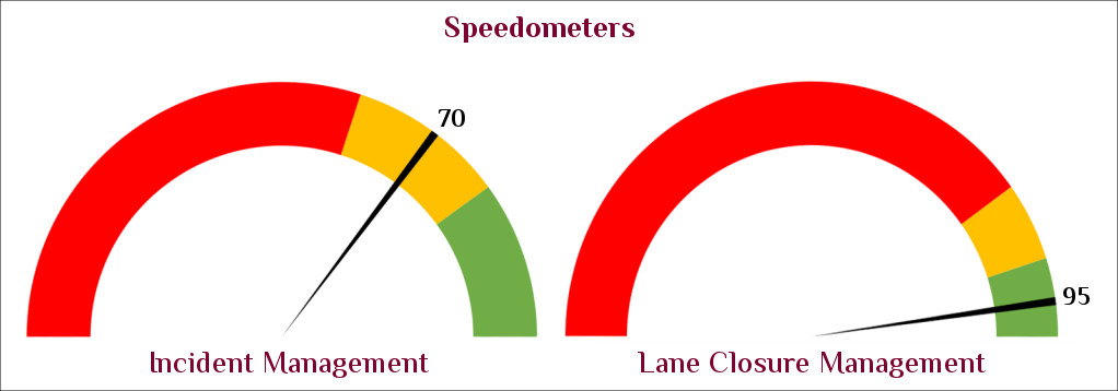
The first dashboard is a speedometer, much like the ones you’ve seen in your car. These are most useful when the performance measure is taken at the present moment, and past trends or future trajectories don’t matter as much as where the organization is, right now.
The red portion of the dial represents unacceptable performance. The yellow is borderline, and the green zone is desirable.
In the example above, from transportation management, the Incident Management dial shows a measure of 70, in the yellow zone. This means that at the present moment, the Incident Management measure is borderline. The Lane Closure Management dial shows a measure of 95, in the green zone, indicating that Lane Closure Management is doing well. The green zone for Lane Closure Management is narrower than the green zone for Incident Management, showcasing the ability to flexibly display different performance thresholds simultaneously.
The applications range well beyond transportation. A dial could represent current service times, with red representing service which is too slow and green representing fast turnaround. A dial could be used to showcase staffing levels, with red representing not enough personnel and green representing adequate coverage.
These dials are very useful to show a snapshot in time: where are we now against our desired performance levels?
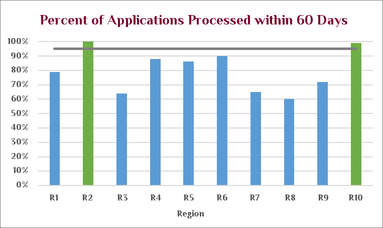
Dashboard 2: Goal Achievement by Category
Our second dashboard is a bar chart, and this is helpful when we want to track goal achievement by category, at a single point in time. In this case, our goal is to process an application within 60 days of receipt. The chart enables us to see immediately which regions (R1 through R10) are achieving the goal.
Percent of applications processed within 60 Days
The same bar chart dashboard can be used for any other performance goal, from the number of items processed to the percentage of defects. The goal bar (the vertical axis) can move up or down, as the organizational objectives change. This organization wanted to show regions on the horizontal axis, but one could show departments, product lines, and many other categories.
These charts don’t track historical progress or make future trend projections – they simply point out where the organization is, right now, relative to goals.
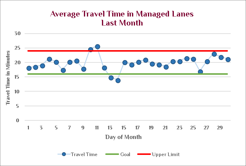
Dashboard 3: Time Series Chart with Boundaries
This is a time series chart with boundaries. It is helpful when an organization has historical data and wants to see trends and outliers.
This particular chart shows average travel time over the past month. It plots the actual data in blue, and the upper and lower limits are represented by the red and green bars. In the case of travel time, longer travel time is worse, so that bar is colored red, while shorter travel time is better, and so that bar is green. From this chart, we can immediately see that while the travel times are in general between the goal and the upper limit on travel times, there were some slowdowns around Day 10 and speedups about Day 13. This could represent traffic patterns over a holiday weekend, construction, or something else.
These charts can be very useful if an organization is changing its processes. We can mark when the process changed, and see from the chart if there has been any meaningful movement in the outcomes.
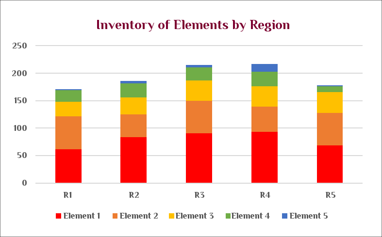
Dashboard 4: Stacked Bar Chart
This stacked bar chart is useful when we have two pieces of information about one thing and want to display them both simultaneously. This particular chart shows a breakdown of different types of traffic elements by region. (A traffic element could be a traffic light or a stop sign.) Here, we have both the region and the type of element. This stacked bar chart lets us see how many total elements are in each region, and also, for a given region, how many of each individual element type we have.
This chart gives us regional totals. We can easily see from the top of the graph that R3 and R4 have the most total elements in them, over 200 apiece. The colored breakdown also shows us individual inventory. We can see that Element 1 (the red part on the bottom) is the largest component of our regions, and that Element 5 is a relatively small part of the total inventory. We can also see that Element 4, the yellow bar, remains relatively constant across all the regions.
This graph type is also a snapshot in time. As drawn, it doesn’t show historical data or make future predictions.
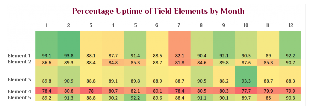
Dashboard 5: Heatmap
This chart is a heatmap, in which different cells are colored based on their values. Red represents lower performance, and the green represents higher performance. This is very useful when we want to simultaneously display numeric data (here, percentage uptimes) and also display visual patterns.
Here, we have months displayed across the top and elements displayed down the left-hand side. The percentage uptime for each element in that month is given as a number. For example, Element 1 had 93.1% uptime in January. This chart lets us visually see immediately that something is different with Element 4: it’s consistently lower in uptimes across all months. It also lets us see that perhaps something is different in July (month 7); it’s less obvious, but many elements appear to have lower uptimes that month.
Heatmaps are very helpful when it’s necessary to display the numbers. It’s hard to see many differences in a table of black and white printed numbers, but the colors in this heatmap make the different patterns pop out to the viewer.
This heatmap happens to use time across the top axis, but any variable will work: heatmaps can measure inventory vs. product type, or staffing levels vs. targets, or any other piece of numeric data.
Subscribe to the LRI Newsletter for the Latest Tools
 Client Member Area